

Claimtrax app
Tax clarity, end to end.
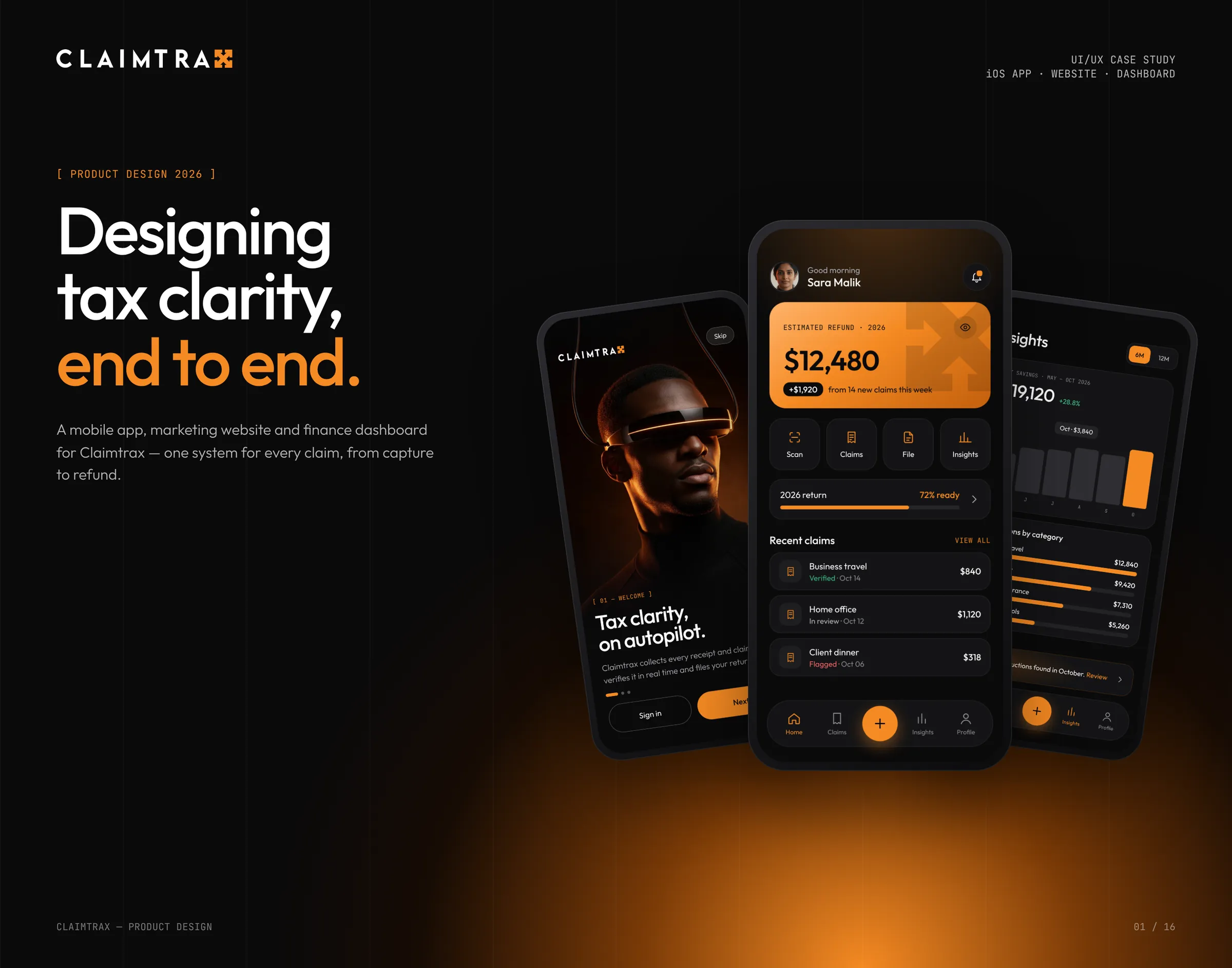
The brief
Turning a shoebox of receipts into one clear return.
Freelancers and small finance teams juggle receipts across inboxes, wallets and banking apps. Deductions are missed, and filing still means spreadsheets and guesswork.
We designed a connected product family around the brand's one idea, Claims in. Clarity out. You capture anything on mobile, follow progress on the dashboard and file in a single tap. The work covered UX strategy, UI design and prototyping across an iOS app, the website and a web dashboard.
- Client
- Claimtrax app
- Sector
- Finance and tax technology
- Scope
- UX strategy, iOS app, Marketing website, Web dashboard, UI kit, Prototyping
- Year
- 2026
- Studio
- Theepa Studio, Dubai
Key decisions
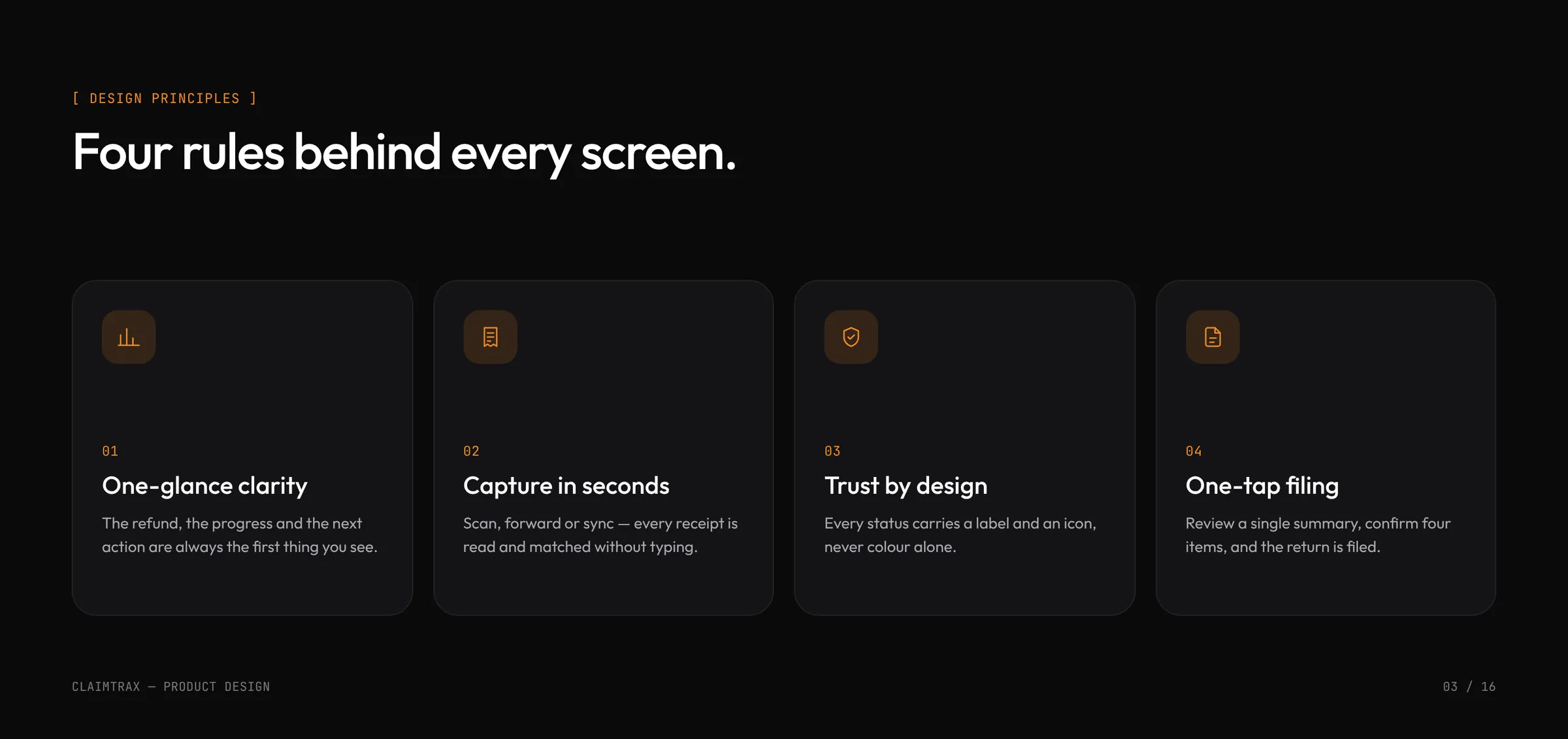
| One-glance clarity | The refund, the progress and the next action are always the first thing you see. |
|---|---|
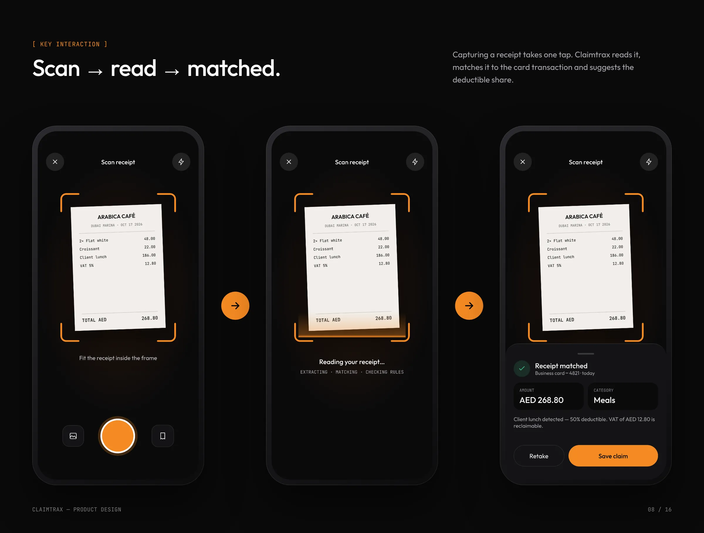
| Capture in seconds | Scan, forward or sync. Every receipt is read and matched to a transaction without typing. |
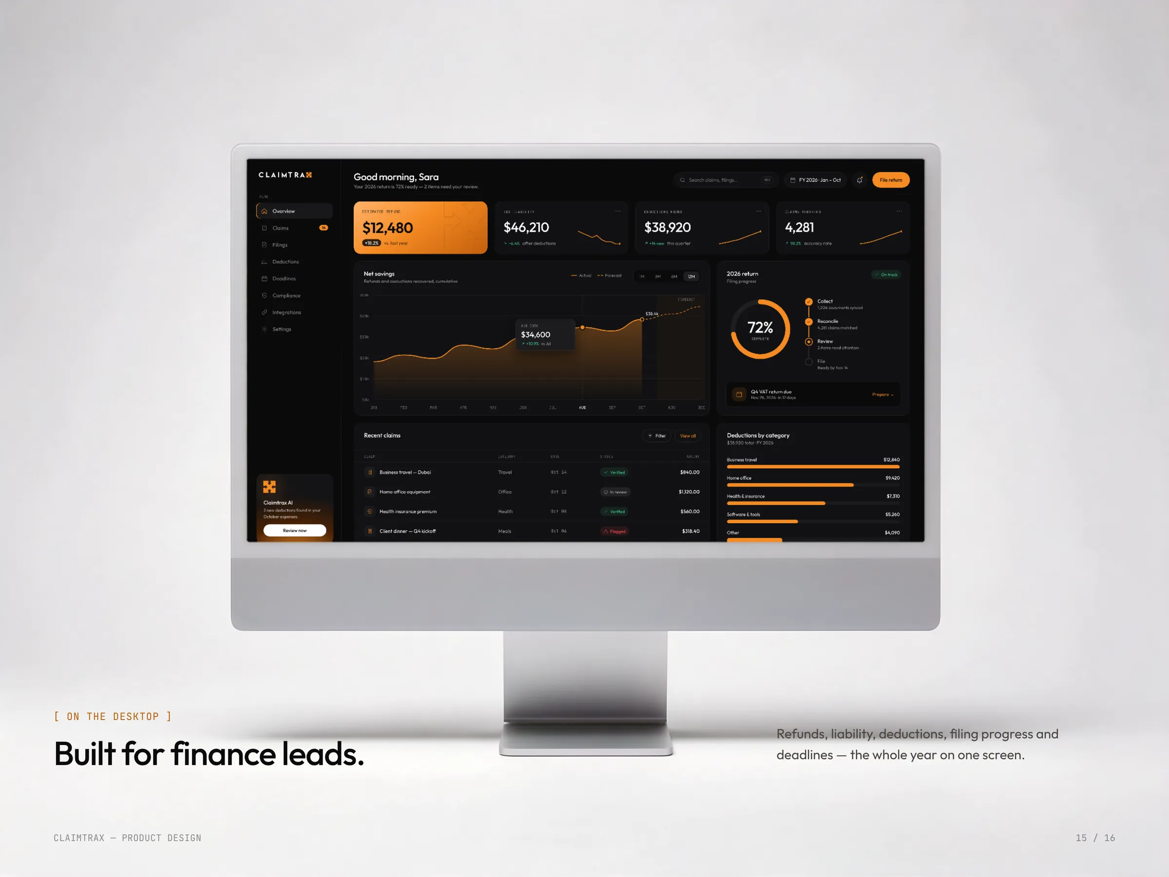
| Trust by design | Every status (Verified, In review, Flagged) carries a label and an icon, never colour alone. |
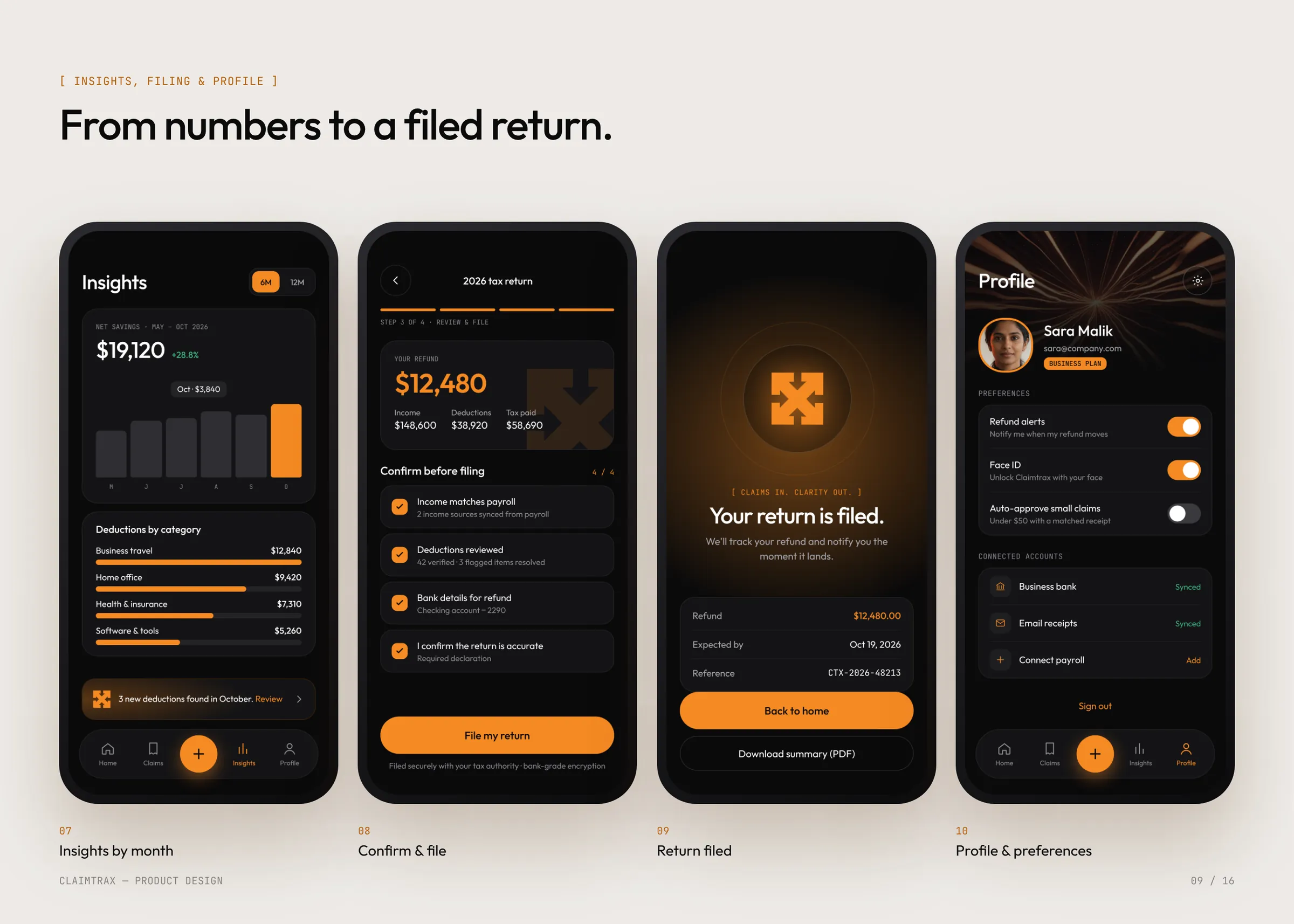
| One-tap filing | Review a single summary, confirm four items, and the return is filed. |
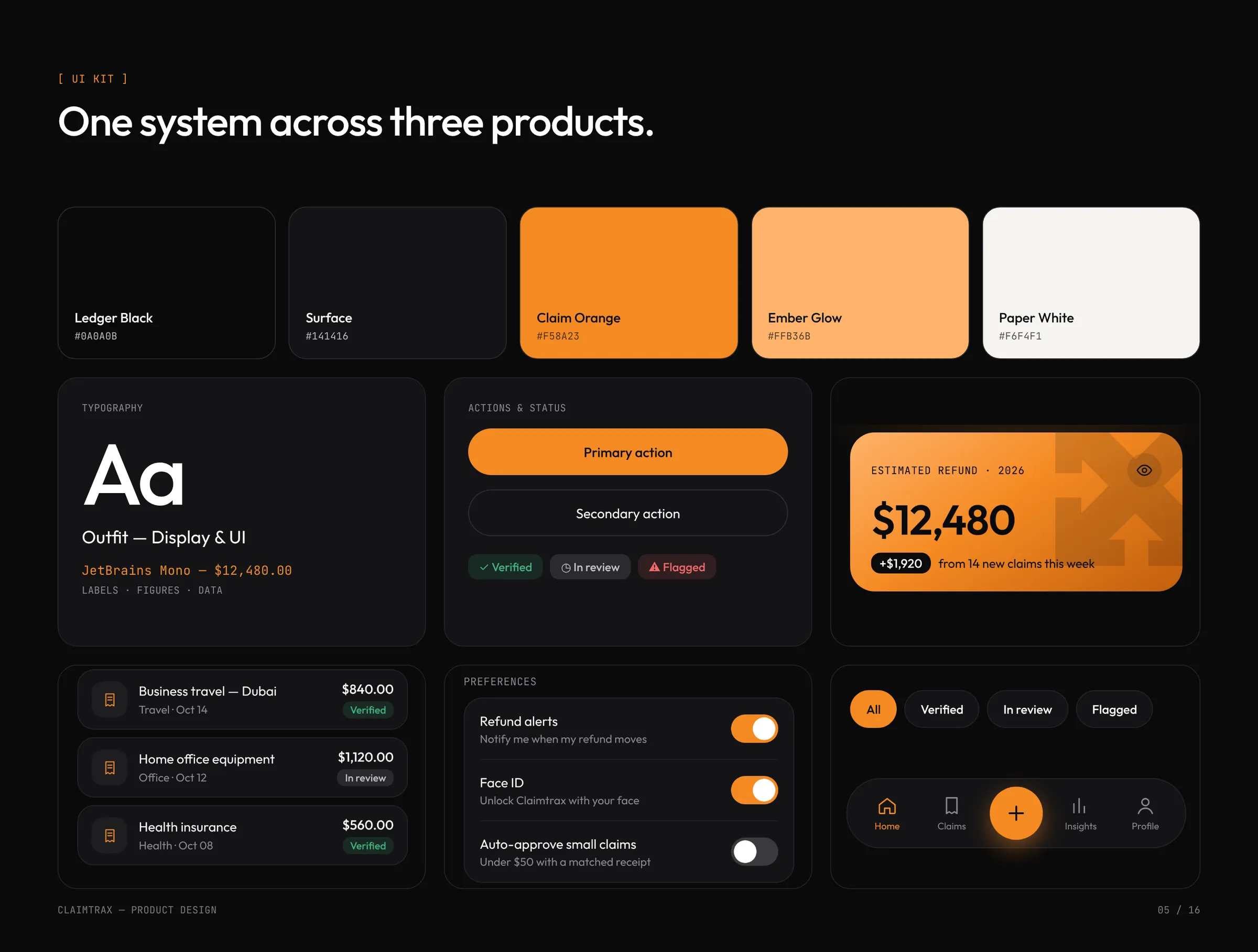
| One system | Ledger Black, Claim Orange, Outfit and JetBrains Mono run through the app, the website and the dashboard, built from one shared set of components. |
The iOS app
Every claim, one tap away.
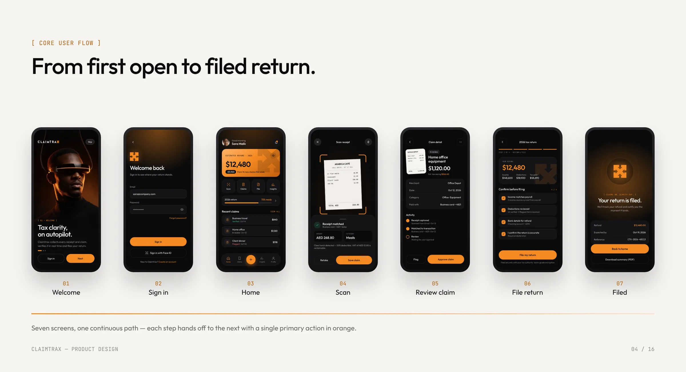
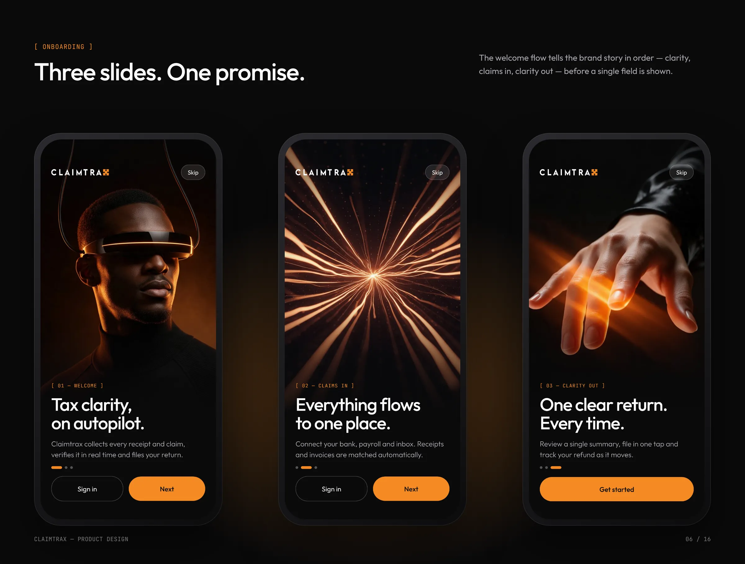
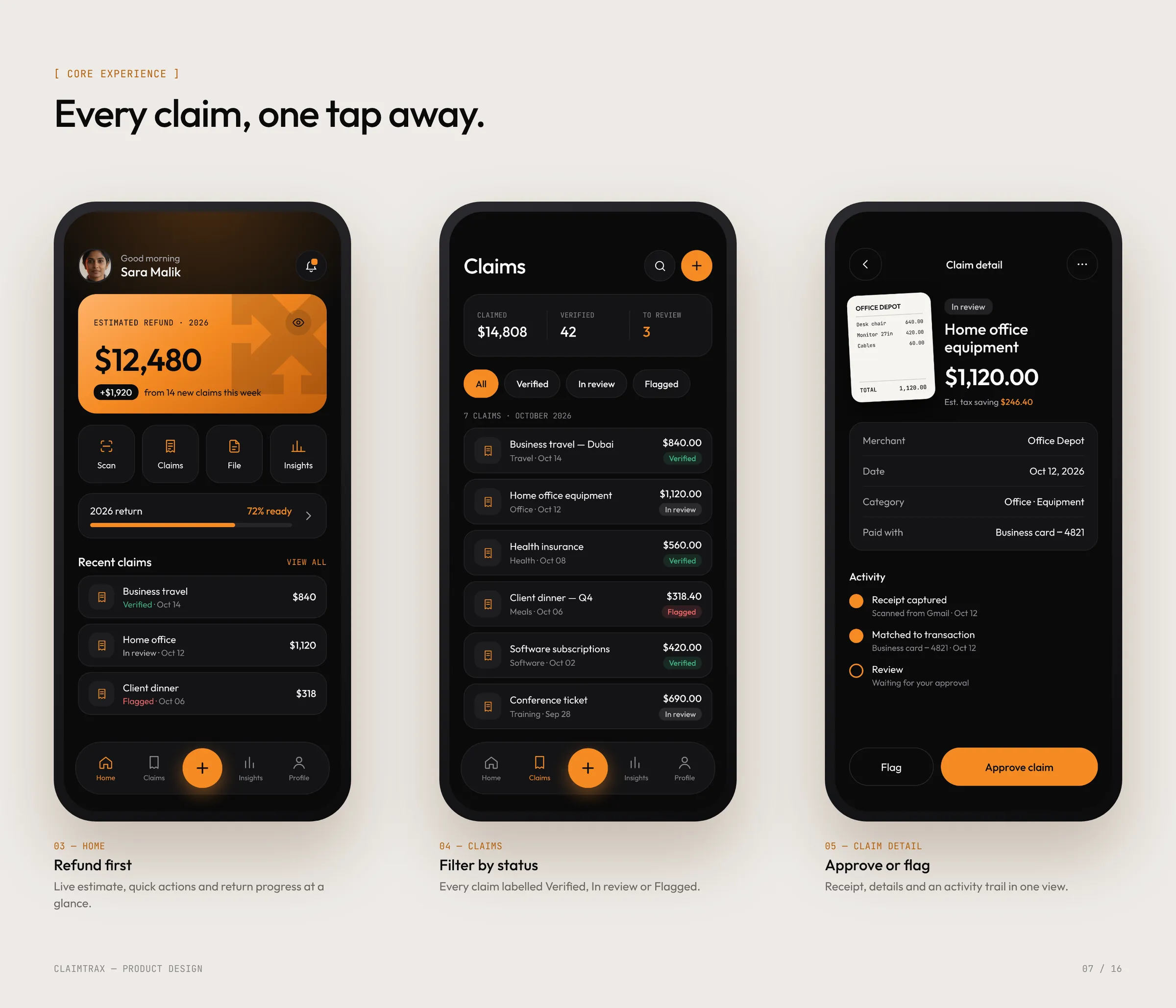
Three onboarding slides tell the brand story in order: clarity, claims in, clarity out. Home leads with the refund estimate, claims filter by status, and every claim opens to its receipt, details and activity trail.
Designed for one-handed use: primary actions sit in the thumb zone and the scan button is always one tap away.

Website and dashboard
Every number, the moment it moves.
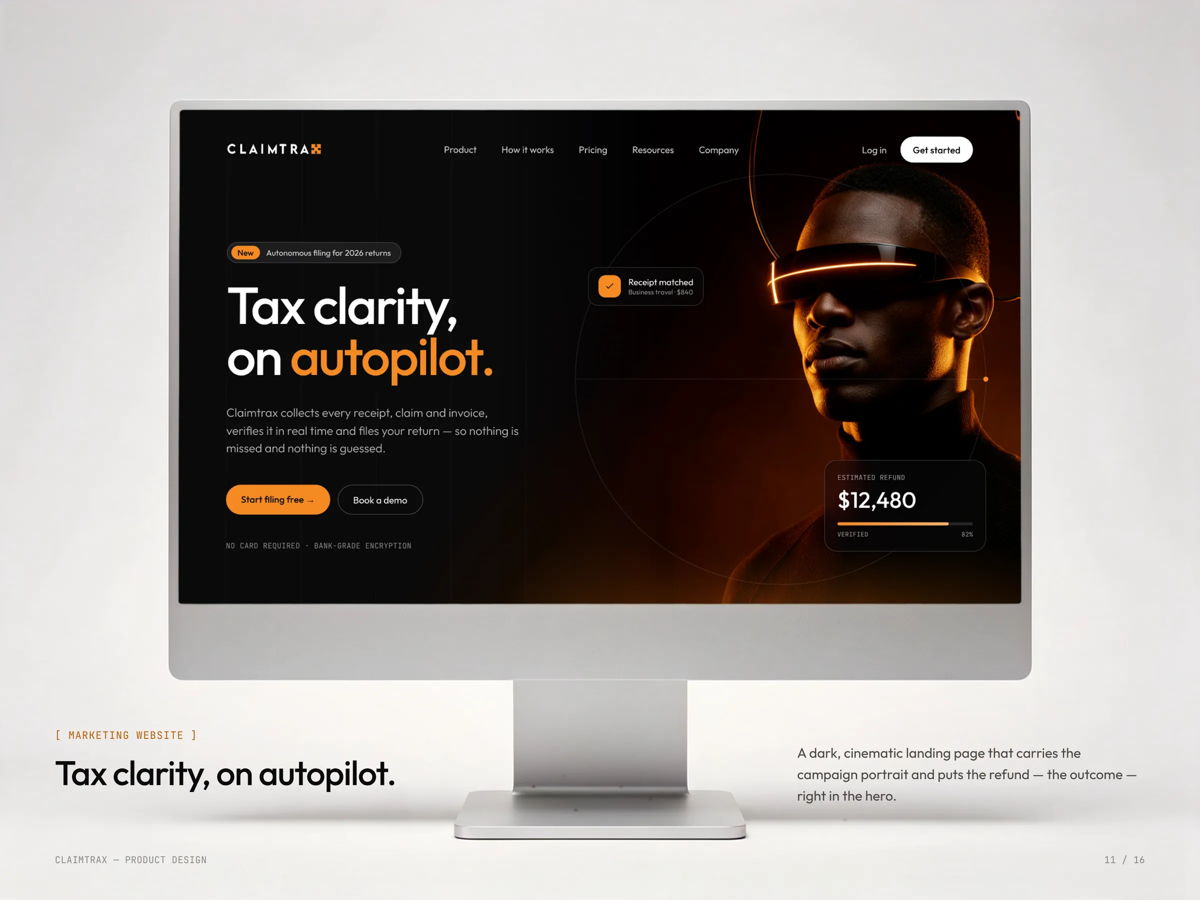
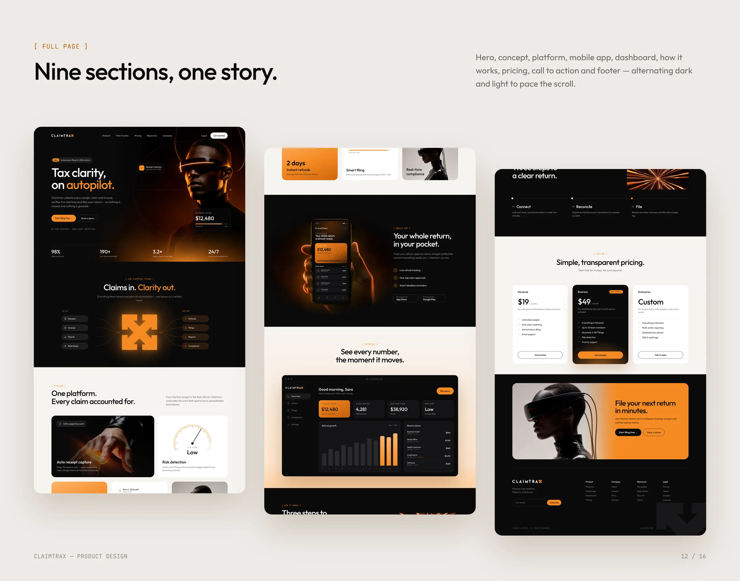
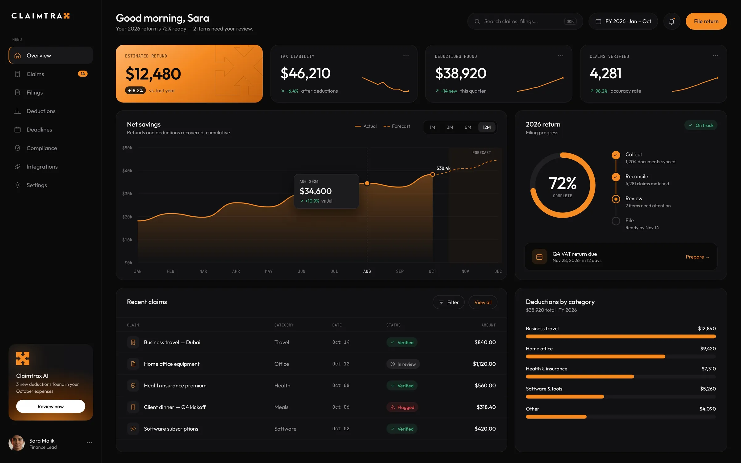
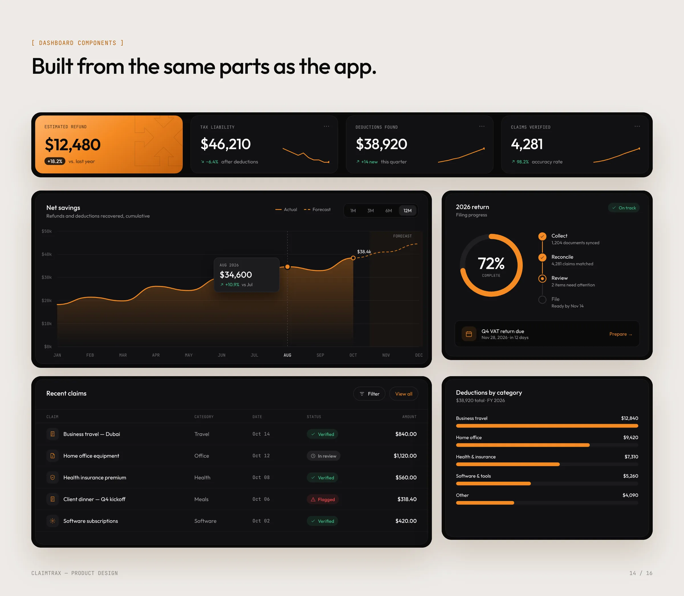
The marketing site and the web dashboard are built from the same parts as the app. The dashboard puts refunds, liability, deductions, filing progress and deadlines for the whole year on one screen, for finance leads who work at a desk.
More work
All case studies


Claimtrax app: questions
Who designed the Claimtrax app?
Theepa Studio, a brand and product design studio in Dubai, designed the Claimtrax app in 2026: UX strategy, UI design and prototyping.
What was included in the Claimtrax app project?
UX strategy, iOS app, Marketing website, Web dashboard, UI kit, Prototyping.
What problem does the Claimtrax app solve?
A mobile app, marketing website and finance dashboard for Claimtrax: one product system for every claim, from capturing a receipt to filing the return.
Can Theepa Studio design an app for my company?
Yes. Book a call and we'll scope a fixed-price product design project with a fixed delivery date.

Want a brand that works this hard?
A 30-minute call. We look at your brand and site together, and you leave with a plan and a fixed price, whether or not you hire us.