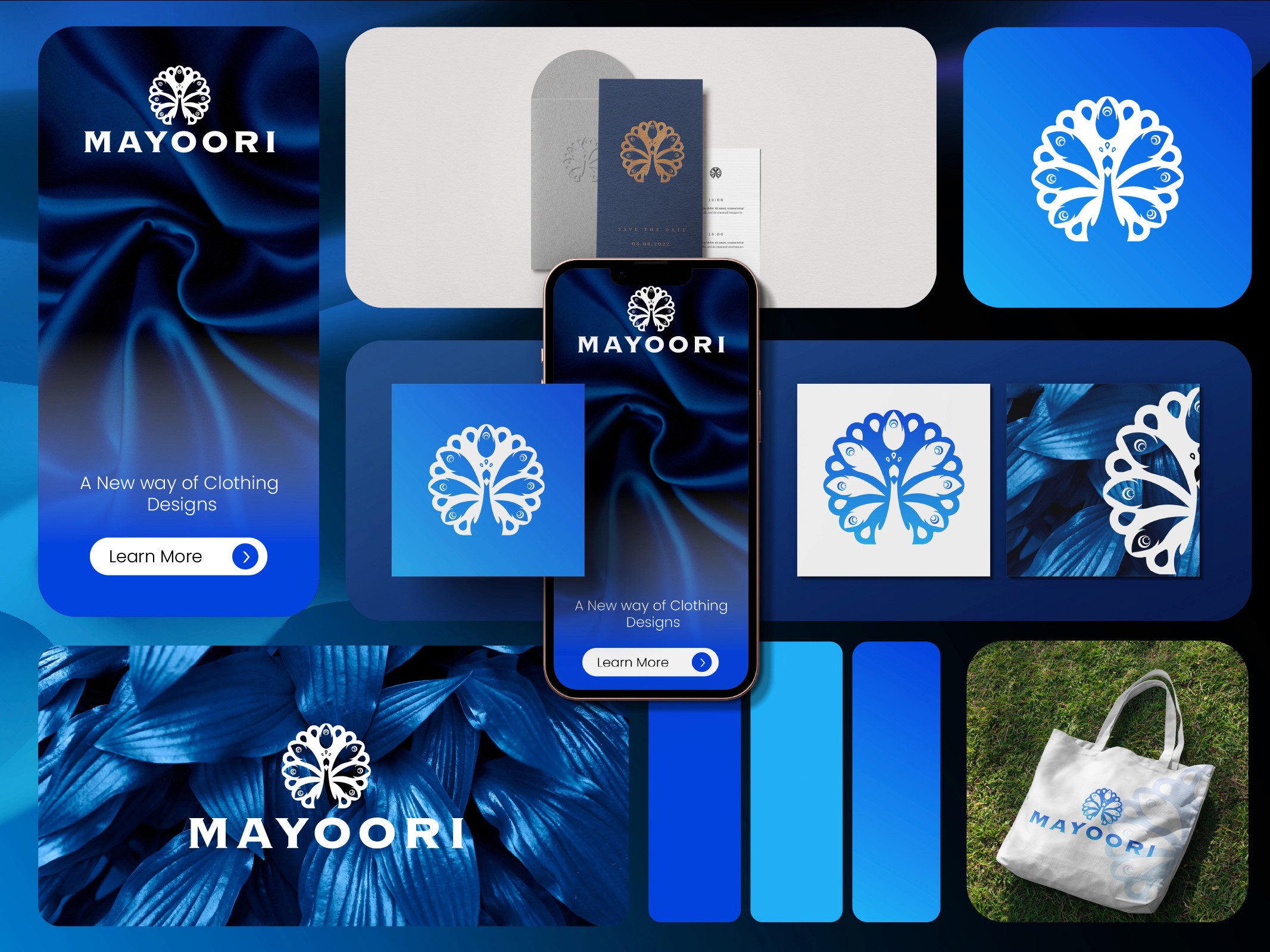

In a world where standing still means falling behind, we knew it was time for a bold transformation.
Web Design vs. Brand Identity: Why They Can't Be Separated
Scroll to read
At Theepa Studio, we're always evolving, and our latest brand redesign is a bold step forward. This transformation reflects our commitment to innovation and growth, both in how we look and how we connect with you.

The Handoff That Breaks Most Websites
A common failure mode: a company hires a brand designer for the logo and guidelines, then hires a separate web agency to implement the brand on a website. Somewhere in that handoff, half the brand gets lost. The web team gets a PDF style guide and does their best, but they weren't in the room when decisions were made about why the brand looks the way it does.
We build both sides at Theepa Studio specifically because of this failure pattern. When the same team designs the identity and builds the site, the type scale, spacing rhythm, and color logic carry through without translation loss.
What Gets Lost in Translation
Brand guides usually specify a primary and secondary font, a color palette, and logo usage rules. What they don't usually specify is motion, hover states, spacing rhythm at different breakpoints, or how the brand voice should read in a 404 page versus a homepage headline. Those decisions get improvised by whoever builds the site, and improvisation under deadline pressure tends to default to generic patterns.
A Website Is a Brand Touchpoint That Runs 24/7
Every other brand touchpoint, a business card, packaging, signage, gets seen for seconds. A website gets scrolled, clicked, and judged over minutes, sometimes across multiple visits before a purchase decision. That makes inconsistency more visible on a website than almost anywhere else. A slightly-off blue on a business card is forgivable. A slightly-off blue repeated across forty product pages compounds.
Practical Fix If You Can't Combine Teams
If budget means brand and web have to be separate projects, insist on one deliverable most style guides skip: a component-level spec, actual button states, actual card layouts, actual spacing tokens, not just a color palette and two fonts. That's the layer where brand actually survives implementation.
We rebuilt our own site around this principle, moving from a template-based build to a from-scratch multi-page structure where every section is designed and coded from the same source material. It's slower than templating, but it's the only way we've found to keep a brand from thinning out once it hits a browser.