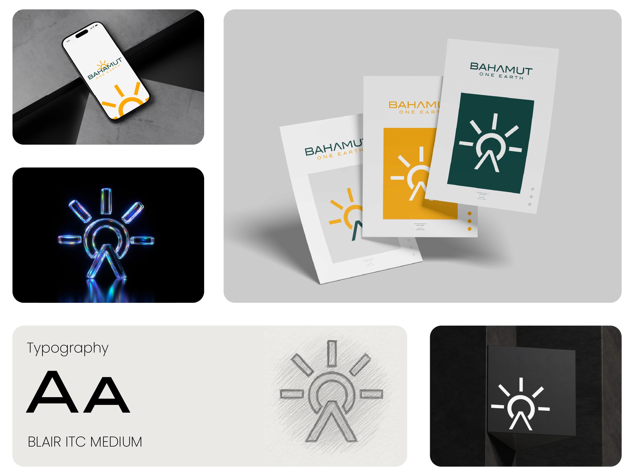

In a world where standing still means falling behind, we knew it was time for a bold transformation.
The Psychology of Typography in Brand Design
Scroll to read
At Theepa Studio, we're always evolving, and our latest brand redesign is a bold step forward. This transformation reflects our commitment to innovation and growth, both in how we look and how we connect with you.
Typefaces Carry Meaning Before Anyone Reads a Word
Set the exact same sentence in a rounded sans-serif versus a sharp geometric sans-serif, and readers will describe the brand behind each one differently, even when the words are identical. One reads friendlier. The other reads more authoritative. Neither reaction is conscious; it happens before comprehension.
This is why type selection is one of the first decisions we lock in on a brand project, often before color. Type sets the emotional register everything else has to match.
Serif vs. Sans Isn't the Real Divide
The serif-versus-sans debate gets oversimplified into traditional versus modern. The more useful distinction is contrast and stroke weight. A high-contrast serif, thin and thick strokes varying a lot, reads as editorial and considered. A low-contrast sans reads as functional and direct. A brand selling craftsmanship benefits from the first. A brand selling speed or efficiency usually benefits from the second, regardless of whether it technically uses a serif or sans font.
Letter Spacing Changes Trust, Not Just Aesthetics
Tight letter spacing at small sizes reads as dense and can feel evasive, like fine print. Slightly open spacing in headlines reads as confident, like the brand isn't in a hurry to fill the space. This is a lever most founders never adjust, but it shifts how legal disclaimers, pricing, and terms feel to read.
The Mistake We See Most Often
Clients often pick a display typeface because it looks striking in a headline mockup, then discover it's unreadable in a paragraph of body copy or a mobile notification. A type system needs at least two weights that hold up in small sizes before it's usable across a real product, not just a hero image.
How We Approach It
At Theepa Studio our own type stack pairs a geometric display font with a neutral body font and a monospace accent for technical detail, three roles, not three decorative choices. Each one does a specific job: identity, readability, precision. That's the framework we bring into client projects too, matching type roles to what a brand actually needs to communicate, not just what looks good in a single screenshot.