

In a world where standing still means falling behind, we knew it was time for a bold transformation.
Minimalism vs. Maximalism: Choosing a Visual Direction for Your Brand
Scroll to read
At Theepa Studio, we're always evolving, and our latest brand redesign is a bold step forward. This transformation reflects our commitment to innovation and growth, both in how we look and how we connect with you.
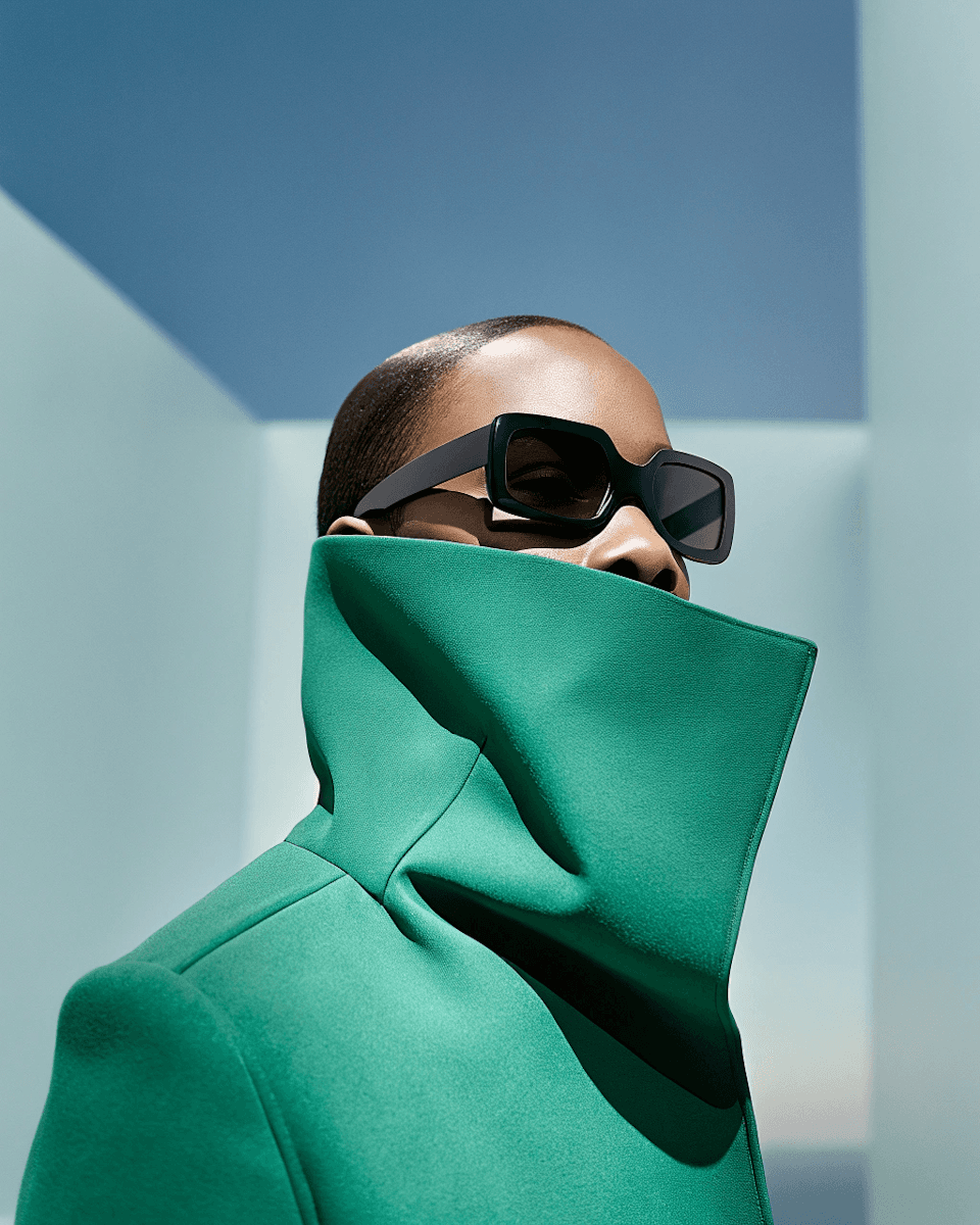
The Wrong Question Most Founders Ask
"Should our brand be minimal or bold?" is the wrong starting question, because it treats visual density as a personality trait rather than a functional decision. The right question is what your customer needs to process quickly, and what they're willing to spend more time exploring.
Minimalism Solves a Specific Problem
Minimalism works when the product or message is complex and the design's job is to reduce friction, financial tools, healthcare, anything where a confused user is a lost user. Strip away decoration and the interface gets out of the way of the decision the user actually needs to make.
The risk with minimalism is sameness. Reduce enough brands to white space, one accent color, and a geometric sans-serif, and they start looking interchangeable. We've turned down "just make it clean and minimal" briefs before, because clean without a point of view is the fastest way to disappear into a category.
Maximalism Solves a Different Problem
Maximalism works when the goal is memorability in a crowded, low-attention environment, packaging on a busy retail shelf, or a hospitality brand competing for attention on social media. Density and pattern give the eye something to linger on, which matters when the brand's job is to be noticed before it's understood.
The risk here is legibility. Maximalist brands age faster and translate worse across formats, a densely patterned Instagram post doesn't necessarily work as a small packaging label or an app icon.
What We Actually Recommend
Most strong brands aren't purely one or the other. They're minimal at the system level, one strong mark, a disciplined palette, and expressive at the content level, photography, illustration, packaging inserts, where density can flex without breaking the core identity.
That layered approach is what we build into every identity system: a restrained core that holds up anywhere, and expressive layers that can flex by channel without diluting the brand.